Absolutely! I agree with our earlier post, Ideas Without Words—or Pie Charts. Information is beautiful in charts like Caffeine and Calories. I would use this or a similar treatment each and every time the client says: “Designer, go forth with this here unlimited budget and a whenever deadline, and just… CREATE!” Alas, the world of business graphics is a small box with little wiggle room. First, you’re beholden to branding guidelines, often prohibitive of cutesy pictures. Second, the budgets are narrow and the amount of time we designers are given to turn around time-sensitive business data will take your breath away. So, we call upon the workhorse which is PowerPoint. In PowerPoint, we plot out vital information in yes, pie charts, which every single soul can interpret at a glance. In his epic Say it with Charts: the Executive’s Guide to Visual Communication, Gene Zelazny of McKinsey&Company explains, “Because a circle gives such a clear impression of being a total, a pie chart is ideally suited for the one purpose it serves: showing the size of each part as a percentage of some whole, such as companies that make up an industry.” Is there a cleaner way to show this?
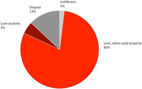
Content Bureau Teammates’ Feelings About Pie Charts (n = 25)

I know it’s just a humble circle, but we have yet to invent something better than the wheel.


