You have a mountain of valuable data—but how can you use it to convey a poignant message? The answer: a simple but powerful bar, line, or pie graph that will help your audience quickly understand the meaning of your data. Here are a few basic types of graphs:
Bar graph
A bar graph is used when there are two variables, and is helpful when comparing groups or tracking changes over time. The bars can be vertical or horizontal and represent relative value or frequency. A line graph also can be used in these situations, but a bar graph is preferable when illustrating magnitude rather than direction.
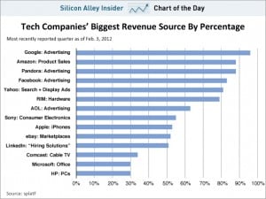
Bar graph example: two variables
In this case the time period is constant, but biggest revenue source by percentage is being compared—underscoring the fact that Google’s revenue stream (top line of chart) is the least diversified.

Line graph
A line graph is also used when there are two variables—but only makes sense when you’re tracking changes over a continuous measurement (e.g., time, temperature, distance). Line graphs are especially useful for illustrating direction (i.e., peaks and dips) rather than magnitude.
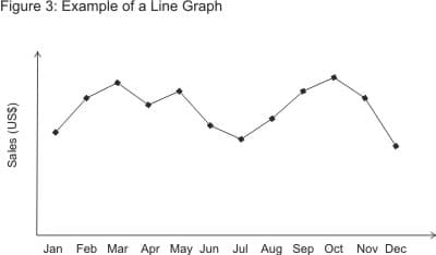
Line graph example: two variables
In this line graph, the dip in the summer months and beginning/end of the year illustrate the seasonality of this company’s business.

Pie graph
Unlike a bar or line graph, a pie graph is used when there is only one variable and is best for comparing parts of a whole. The sum of the pieces always equals 100 percent, and the visual conveys a relative value or frequency. A pie graph is not particularly insightful if all parts are about the same or if there are too many discrete pieces.
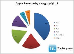
Pie graph example: one variable
In one quick glance, this pie chart tells us that the iPhone brought in the bulk of Apple’s total Q1-11 revenue.

As these graphs demonstrate, when making comparisons, illustrating trends, or highlighting relationships, the old saying rings true: A picture is worth a thousand words.
How will you know which type of graph is best suited for your data? Ask yourself:
- How many variables do I have?
- Am I trying to highlight a trend over time or make a comparison?
- Or am I illustrating a relationship between parts of a whole?
Your answers will steer you towards the right answer.


