
When people first started interacting with computers, software designers chose visual metaphors to help users acclimate to the new environment. The folder icon is a good early example. It immediately made sense that this was a place to store documents. The idea that one could organize documents in folders was perfectly intuitive because it was wholly consistent with our physical world experience. Mission accomplished.
![]()
Fast-forward several decades, and we find ourselves in a digital world where the calendar on our computer looks like an old desk planner, replete with faux leather borders and heavy stitching—even stray paper scraps left behind from the last month we’d torn off. Or where the notes app on our smartphone looks like a legal pad: yellow, lined, and with that handwritten font. Or where eBooks and digital magazines sit neatly on faux wooden bookshelves.

This practice is commonly referred to as skeuomorphism. Per Wikipedia, “A skeuomorph is a physical ornament or design on an object made to resemble another material or technique.” Skeuomorphs are typically used to make something new feel familiar, in an effort to speed acclimation. Often, though, they employ elements that—while essential to the original object—serve no purpose in the new system (think pretend binder rings).
If you’re old enough to remember the original objects, the comfort skeuomorphs can provide offers a reasonable argument for their existence. But what happens when the user has never used—or even seen—the artifact upon which a new interface is based? How many recent college grads have ever interacted with a Rolodex? Or a pocket appointment book? And skeuomorphs don’t need to be visual: How many teenagers have actually taken a picture on a camera with a mechanical shutter? How effective can a visual metaphor really be if it predates its audience?
Some users find skeuomorphs fun, if not always useful. But as the ornamentation becomes more excessive, it can actually hurt the overall user experience—and that’s when “real” becomes wrong.
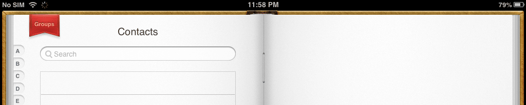
Those book and magazine covers could be significantly larger (and actually readable) if there weren’t so much shelving in the way. And that contacts app on my tablet that looks just like a book would be a heck of a lot more usable if I could actually flip the pages by swiping (epic metaphor fail).
Taken as a whole, digital skeuomorphism inherently leads to inconsistency across applications, making the overall experience less intuitive. There’s even concern that making new things look too much like old ones will actually stifle innovation, with arbitrary visual accuracy unnecessarily perpetuating the physical limitations of knobs and switches.
Microsoft has all but abandoned skeuomorphic design with the flat style of Windows 8’s Metro UI. And Apple—historically one of the worst offenders of bad skeuomorphism—is rumored to be following suit with its upcoming mobile OS release.
Will users miss the kitschy realism? Or is fake wood just as wrong in the digital world as it is in the real one?


